
Centrepiece of the Social Sciences
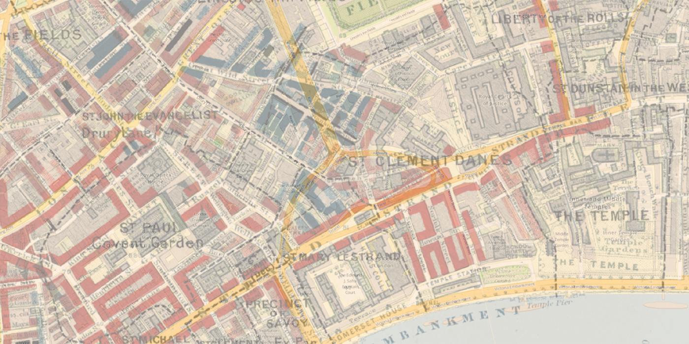
The LSE campus will undergo its largest redevelopment since the foundation of the School. The East building, Clare Market, the Anchorage and part of St. Clement's will be demolished and replaced with a single large building spanning the space from Columbia House to the Lionel Robbins building. The redevelopment represents an one-time opportunity to create a centrepiece within London, the United Kingdom and the world for the social sciences. I review and critique the 5 submitted architectural designs on their conceptualisation of the public space, their capture of natural light, their public visibility and branding potential, their success in establishing a grand boulevard and their ability to bring balance to the School's physical campus.
A School Plaza:
Team A before Team E
The LSE campus is an indistinct amalgamation of building and narrow pedestrian thoroughfares and public roads. The planned redevelopment represents a one-time opportunity to establish a larger plaza, significantly more expansive as the John Watkins "plaza", acting as a focal point of the social life of the LSE community and featuring School buildings old and new as a backdrop.

Team E has best captured the essence of a fully outdoor plaza. It would be bounded by a new tower to the east featuring student servicing areas on the lower levels, the library to the north, the remaining part of the St. Clement's building to the West and the main body of the new development to the south. In contrast to the plaza in the design of Team B, the high-rise Thomas More building, which is not part of the LSE campus, would be effectively shielded and, hence, would not be allowed to dominate the new public square.
Team E has spun the outdoor plaza concept further by creating a combined inside/outside area on the level of and along Houghton Street. The other teams have done the same to differing visual and practical effect. I find this realisation of a plaza more compatible with the character of the School as compared to a purely outdoor space. There are lots of large outdoor public squares in the City, which are underutilized. The extension of Houghton Street, an important landmark in its own right, into the new building torso would complement and expand the quirky mesh of buildings and thoroughfares as an expression of the School's physical campus. I would forego wasting valuable real estate on an oversized outdoor plaza. Hence, my first nod goes to the inside/outside scheme of Team A. It's level with Houghton Street over the entire breath of the building, representing a true plaza against the levelled designs of Teams C and D. You don't want to have the School plaza dominated by sweeping stairs. Despite featuring a smaller squared outdoor space and a limited expanse of the inside/outside street-level plaza concept, Team E also gets a nod. I cannot recognise any such interpretation of a plaza in Team B's design.
A Cathedral of Light:
Team B before Teams A and E
The right to light under London's zoning regulations and the associated financial compensation on its restriction will guide the elevation profile of the new building. The main challenge will be to not encroach on the existing light envelope of Aldwych House, which unfortunately still doesn't belong to us.
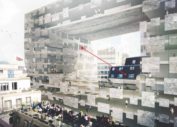
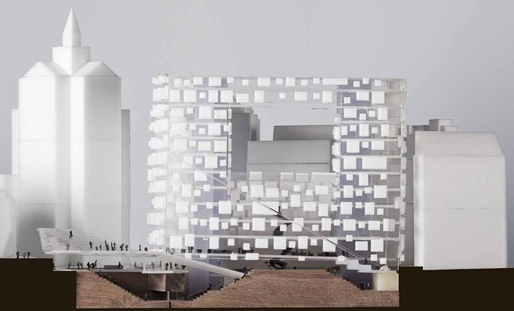
That said I'm somewhat disappointed with all 5 proposals in that they haven't forcefully pursued the free light envelope above the surrounding buildings. They all have a high-rise feature but waste useful volume over a large part of the footprint available to the new building. I would have pursued a far more daring and imaginative concept: a two-volume ensemble. The first volume would be a low-rise building between the Old Building and Aldwych House, expanding the latter's light envelope. The second volume would be a building elevated by large stilts over the maximum height of the St. Clement's building, possibly even extending over it around the corner. It would be a building, which would "float" over the skyline of our part of London, an imagery further developed by providing it with a glass outer shell. It would be "a floating cathedral of light".
The right to light opening in the design of Team B comes closest to my concept but, again, it is not pursued to the last consequence. In evaluating the 4 other designs on their ability of drawing in as much natural light as possible, Team A and E made a decent job, with Team D and especially Team C apparently preferring artificial indoor lighting.
A Beacon to the Social Sciences:
Team A before Team E
Teams A and E both feature an unique element in their designs: a cubbish red structure as a 3D expression of the red/white LSE logo placed at the highest point of the new building and visible from afar. Team A's "LSE beacon" is larger than Team E's and, by being a perfect cube, has the advantage that the LSE lettering would be visible on all 4 sides. Indeed the beacon of Team A would be quite an addition the London skyline as seen from the south of the river Thames. It would flamboyantly mark that part of the British capital LSE territory: Not really in a traditional sense as the St. Paul's Cathedral dominates the skyline further east but in a truly modern display. I'm sure that Londoners and outside observers will call such a beacon preposterous but why not. Given the span of 50 years, the LSE beacon will be as much accepted as an integral part of the London skyline as many of the other elevated landmarks recognized today.
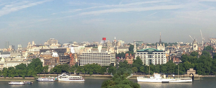
Of course, you can erect a similar structure on highest point of any of the other designs but it is to be proven whether such an foreign element can indeed be harmoniously integrated with the rest of their building fames. I see it demonstrated in the designs of Team A and E but not of the other 3 teams, which is a pity.
A Grand Boulevard:
Team E
Ever since the Lionel Robbins building was added to the School property portfolio have we tried to make a street-level thoroughfare from Houghton Street to the new library. The St. Clement's building was always in the way. Now is the last chance when this can finally be rectified. I envision a grand boulevard extending from the Aldwych to the John Watkins Plaza in front of the library. At the same time, the Clare Market to Clements Inn passage ought to be maintained as a preferred path for students from the halls across the Thames.
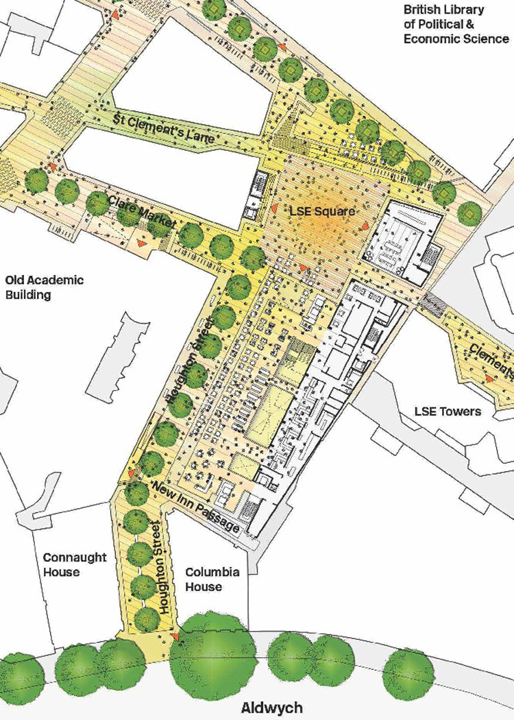
With "boulevard" I mean the real thing not a hole in a building respectively an overarched walkway at the point of the St. Clement's building. When looking north from the front of the entrance of the Old Building, one should be able to see the full height elevation of a good part of the Lionel Robbins building. Only the design of Team E implements that. The almost silly implementation of the north-to-south thoroughfare is from Team C: They themselves describe it as "a medieval-type crack in the block" and that what it essentially is. Team B leaves the Houghton Street end of the St. Clement's building intact. You can walk around that building through their new outdoor plaza to reach the library. The same most eastern part of St. Clement's also stays in the designs of Teams A and D but, at least, they drive a street-level walkway through the building body.
A Street in Harmony:
Team B over D
What the new building should not achieve is to overpower our beloved Old Building. Team C's design may indeed have "a sense of surface, mass and weight" but it is exactly those properties which create a marked dissonance with the Old Building's façade. The Houghton Street elevations from Teams A and E are of the rather plain vanilla City of London-type, not unique enough to create complimentary contrast. This cannot be said of the reversal of the standard window and wall relationship in Team B's design. It is certainly gaudy and, hence, fits into the environment because it is so different. However, I'm not too sure whether such a façade concept is really optimal from a practical standpoint. A happy middle course is taken by Team D. Their design combines two modular looks: The interesting one is the irregular large window bays along the West face, the boring one are the regular concrete-glass patterns especially conspicuous on the high-rise volume. This could have been better executed.
